I would like to introduce the theory that when $t_{c}$ is the critical timing for a crash or destruction, not only in stock prices but also in currencies and metals, $t_{c}$ can be predicted by carefully observing and quantifying the process leading up to it. In my previous research, I have analyzed the reasons for stock price crashes using stochastic differential equations, assuming that stock price crashes occur randomly and that explanations such as triggers and the economic environment are merely afterthoughts. Unfortunately, this does not allow us to predict when a crash will occur.
On the other hand, Prof. Didier Sornette (French, ETH Zurich, Chair of Entrepreneurial Risk) is a scientist who successfully applied his theory to diagnose the damage of major components of the Ariane rocket, and he was able to predict $t_{c}$ (the critical time). Incidentally, he calls those that cause extreme crashes and destruction the “Dragon Kings”. The $t_{c}$ is the moment when the Dragon King appears.
The occasional appearance of Dragon King in the financial markets
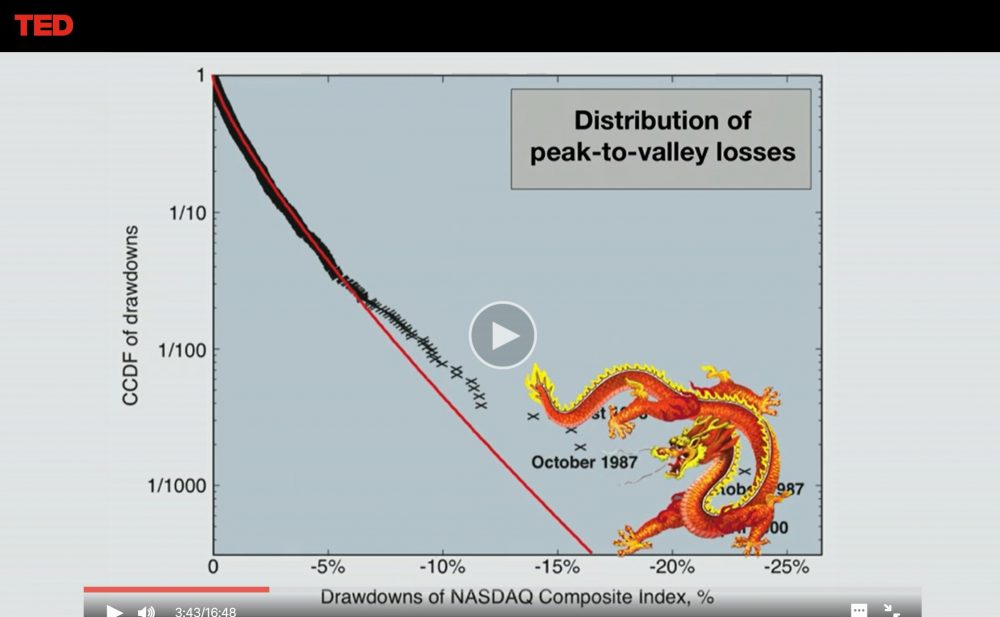
From Didier Sornette TED Global 2013 “How we can predict the next financial crisis
Let’s take a look at the formula. (The formula is taken from his book “Why Stock Markets Crash” Critical Events in Complex Financial Systems.)
First of all, the power law is called the Power Law in English, and its time function is expressed as $F_{pow}(t)$.
$$F_{pow}(t)=A+B(t_{c}-t)^m tag{1}$$.
We choose Black Monday in October 1987 as a typical example of a crash. The gray dashed line is an exponential approximation curve that can be automatically displayed in Excel. The orange curve is the one drawn by equation $(1)$. In comparison, the solid orange curve is a better approximation of the rise before the bubble burst than the dashed gray curve.
Next is the logarithmic period, which tries to express the fact that the interval between waves becomes shorter toward $t_{c}$. We can express its time function as $F_{lp}(t)$.
$$F_{lp}(t)=1+Ccos(ωlog((t_{c}-t)/T)) tag{2}$$.
You have expressed the ups and downs in terms of cosine waves and the change in wavelength over time (shortening) in terms of logarithms. The solid purple line in Figure 1 is the waveform drawn with $(2)$ equation.
Figure 1
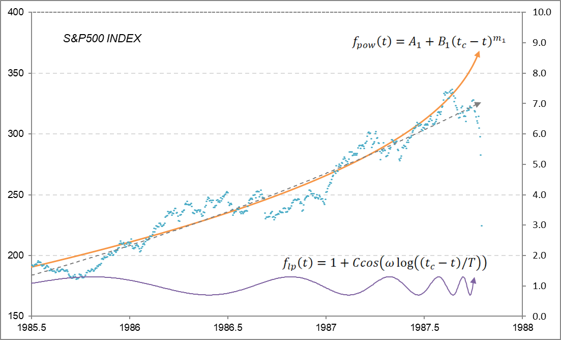
A= 412, B = -158, m = 0.4, C = 0.3, ω = 9.0, T = 1.0, tc = 1987.82 (1 year = 1.0)
And the transition of the stock price to the crash can be expressed by multiplying equation $(1)$ and $(2)$. In other words
$$F_{lp}(t)=A+B(t_{c}-t)^m[1+Ccos(ωlog((t_{c}-t)/T))] tag{3}$$.
This equation $(3)$ is the formula for predicting the appearance of the Dragon King. See Figure 2.
Figure 2
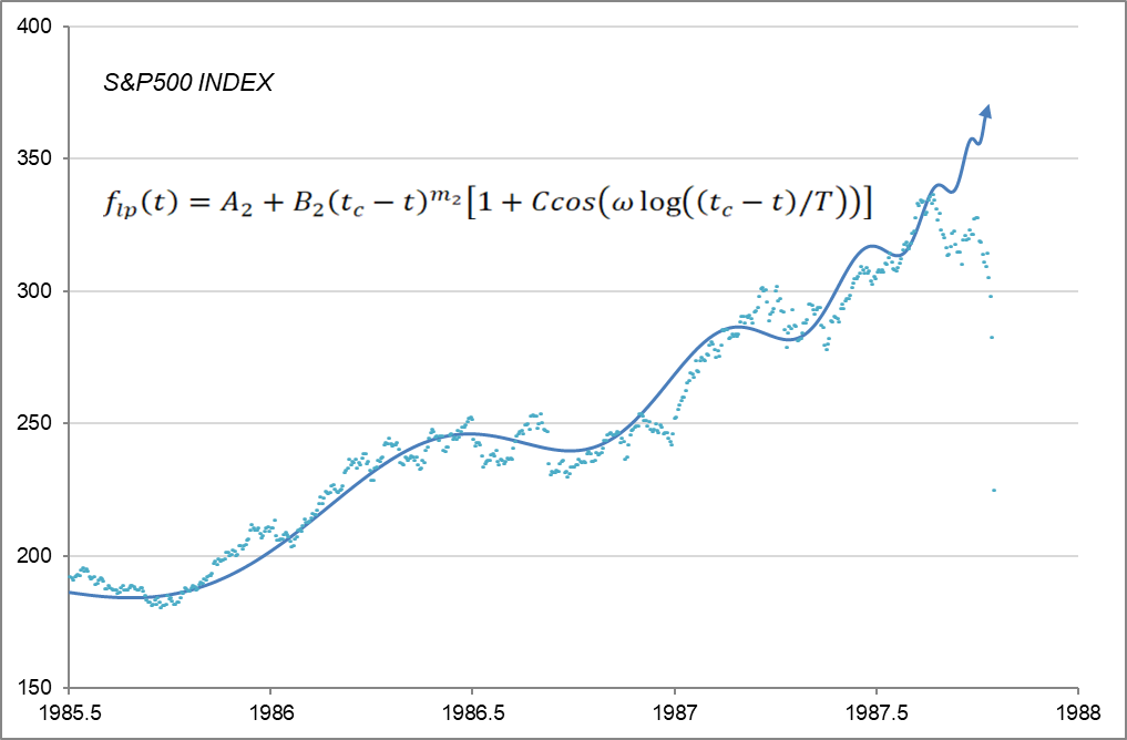
A= 412, B = -158, m=0.4, C = 0.075, ω = 9.0, T = 1.0, tc = 1987.82 (1 year = 1.0)
It is amazing that stock prices, which we thought were moving randomly, can be approximated by a constant function. Moreover, it shows that the march toward a crash started two years ago.
Now, as some of you may have already noticed, in order to draw Figure 2 using equation $(3)$, we need to determine $t_{c}$ in advance. If you know $t_{c}$ from the beginning, you don’t need to predict it in the first place. Rather, in the process of fitting equation $(3)$ to the stock price movement, $t_{c}$ will be determined by itself. So, let’s try this in detail.
Let’s say we are now at the end of 2019. At that point, the S&P 500 is up over 30% from the end of 2018. So, we replace the various parameters in equation $(3)$ and do the fitting work to make it as close to the actual situation as possible. The first half of 2019, with its sharp ups and downs, is concentrated into a single wave, and the second half is represented by the second and third waves, so $t_{c}$ needs to be set to 2020.12 (Figure 3). As a result, we have a prediction that the bubble will burst in about two months.
Figure 3
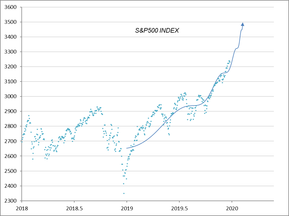
A = 3,820, B = -1,150, m = 0.77, C = 0.03, ω = 15.5, T = 0.58, tc = 2020.12 (1 year = 1.0)
Now, how did the actual stock price change after that? See Figure 4, which shows that the stock crashed after hitting a high of 3,386.10 on February 19, 2020.
Figure 4
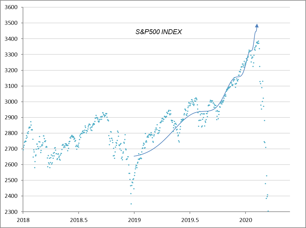
A = 3,820, B = -1,150, m = 0.77, C = 0.03, ω = 15.5, T = 0.58, tc = 2020.12 (1 year = 1.0)
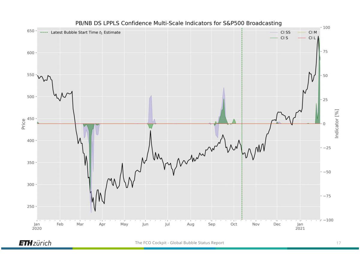
When using historical data, it is easy to think that the parameters have been arbitrarily manipulated because the results are obvious. Therefore, Professor Sornette locked the prediction results so that they could be verified later. He has also created the FCO (Financial Crisis Observatory), a platform for observing bubbles in real time, and has made his predictions available to the public. Please visit the following website.
Incidentally, according to the latest report (dated February 1, 2021), the S&P 500 (Broadcasting sector) is predicted to have entered a bubble period since October of last year (the right side of the green vertical line in Figure 5).
Figure 5
To be continued
<Addendum
If you are interested in the details of the calculation, please refer to Logarithmic Periodic Curve – Excel.
For the second part, please refer to the blogs dated February 15, 2021 and March 14, 2021.
<References
Didier Sornette, Why Stock Markets Crash, Critical Events in Complex Financial Systems, Princeton University Press, 2003
Back to archive