The number of people infected with COVID-19 is predicted by the multiple synthetic waves analyzed in the blogs “Will restraint in going out speed up the convergence of COVID-19 infection?” and “Why the number of COVID-19 infections is surging” dated November 22, 2020. The blue dots are the weekly total of the number of infected people in Japan as published on the website of the Ministry of Health, Labor and Welfare. The solid blue line is the synthetic wave for each variant until December 2021.
In the second half of December 2021, the number of infected people, which had been on a gradual downward trend, seems to have started to increase. The number of people infected with the Omicron variant is rapidly increasing overseas and the effect is spreading to Japan. Let us consider the following two scenarios for the near future prediction.
Scenario a: Assuming the average infectiousness of the variants so far → Orange dashed line
Scenario b: Assuming the same level of infectivity as Type 11, the most infectious species to date → gray dashed line
Number of people infected by COVID-19 (in thousands)
The blue dots are the weekly total number of infected people in Japan.
The dashed line is the number of infected people for each variant, and the solid blue line is the synthetic wave.
The orange and gray dashed lines are the prediction.
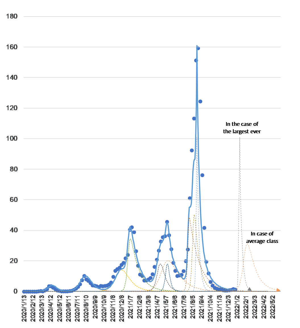
As of December 26 2021
If the number of people who may be infected is $x$ (hereafter, “uninfected”) and the number of people who are infected and may pass it on to others is $y$ (hereafter, “infected”), the rate of change of each is predicted to follow the following differential equation. (Note: The term “uninfected” does not include people who are avoiding contact with infected people or are taking precautions to avoid infection.
$$\frac{dx}{dt}=-bxy\tag{1}$$
$$\frac{dy}{dt}=bxy-cy\tag{2}$$
Equation $(1)$ shows that the number of uninfected people decreases as they come into contact with infected people, while equation $(2)$ shows that the number of infected people increases as a result, but they are cured or die and are no longer infected. The coefficient $B$ is the “infection coefficient” and $C$ is the “cure coefficient”. The coefficients for each wave (dashed line) that makes up the synthetic wave (solid blue line) are as follows.

For your reference (compiled from the MHLW website and press-related materials)
Cumulative total number of PCR tests (blue dots), positive cases (green line), and deaths (gray line) on logarithmic axis
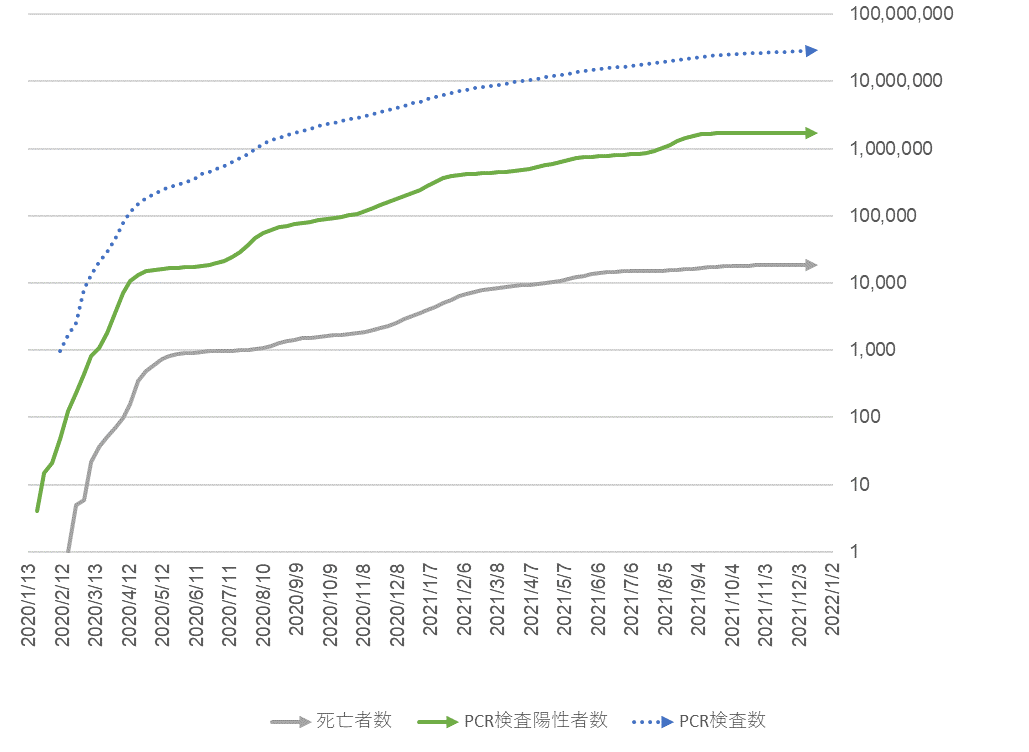
As of December 26 2021
PCR test positive rate (green line), mortality rate of positive patients (gray line) and cumulative total number of PCR tests (blue dots) by week
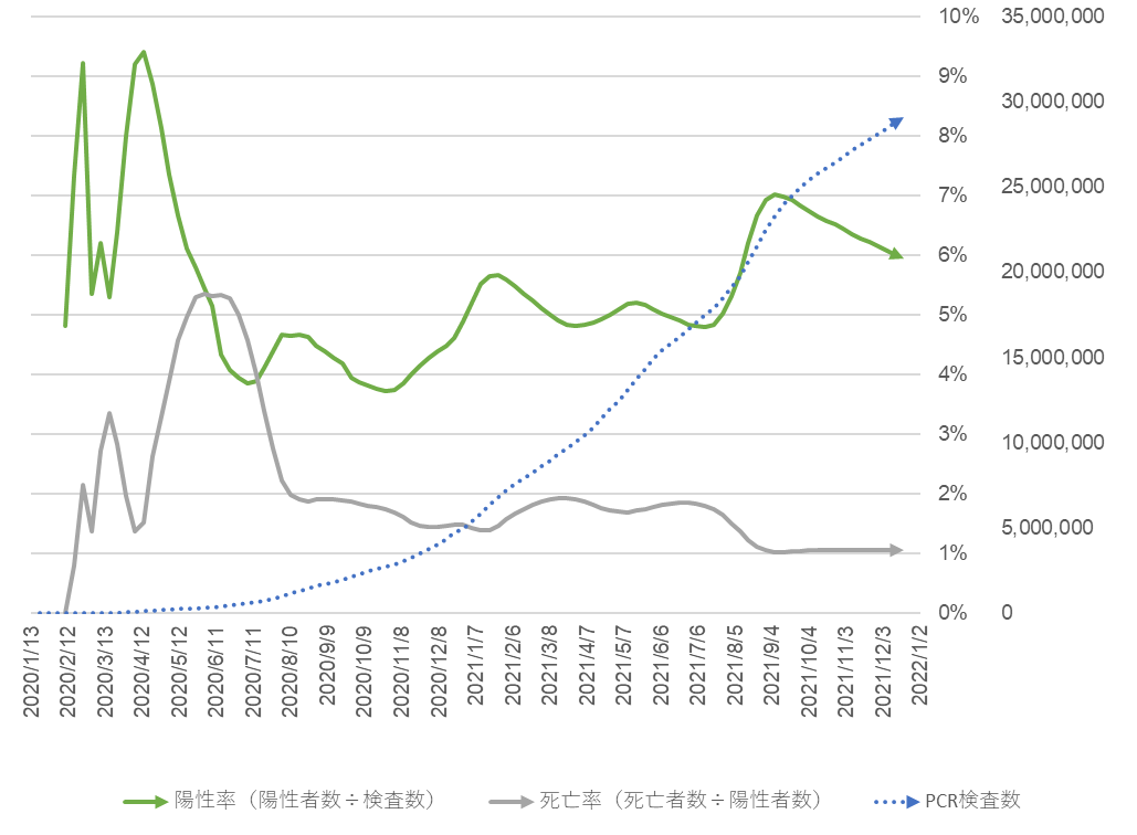
As of December 26 2021
Monthly trends in the number of PCR tests and deaths due to COVID-19
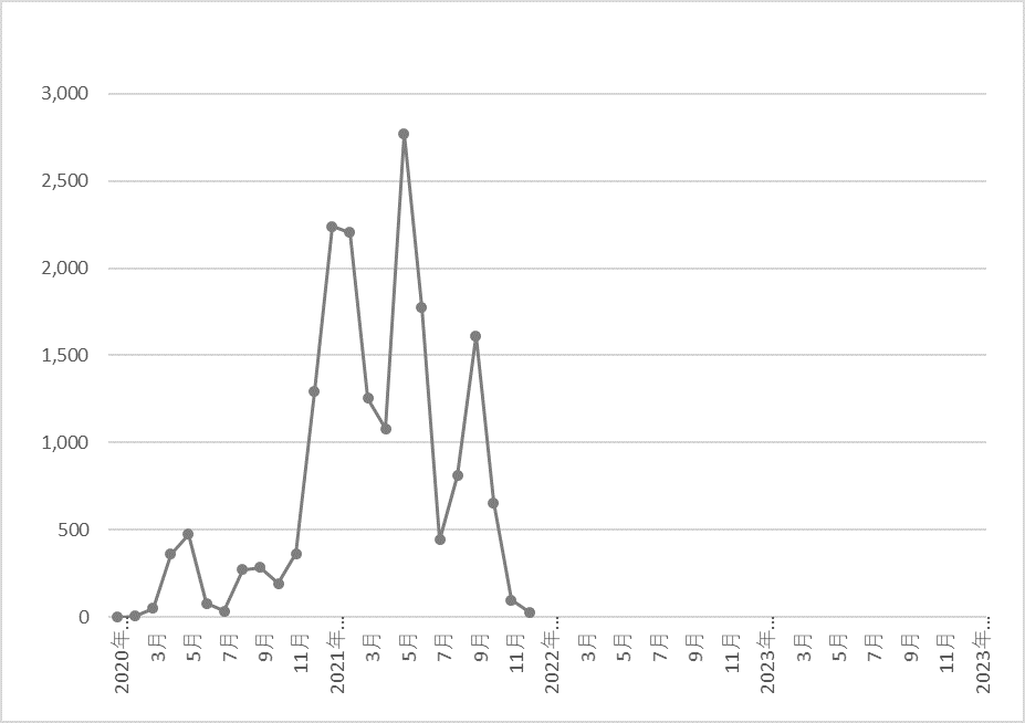
Since 2020 up to date
Compared to the Spanish flu that was prevalent 100 years ago, the number of variants is larger and the interval between their appearance is shorter.
Monthly death toll from the Spanish flu epidemic of 1918-1921
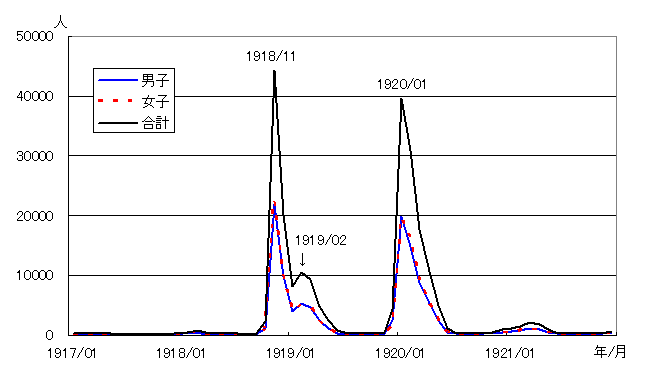
Tokyo Metropolitan Institute of Health and Safety Annual Report 56, 2005
The end